Clip Mobile App
Clip is growing and in order to continue to keep our merchants competitive a complete revamp of our application was in order. The update keeps the ease of the Clip transaction process but adds a robust inventory system to the Clip application. The update also included a full dashboard section and an ease to navigate settings menu.
WHY AN UPDATE?
The original Clip app was. . . outdated. The way the application was built did not allow for additional features to be added without making the mobile application cumbersome and not very user friendly.
The UX team at Clip got together and proposed a full revamp of the application and kicked off a year of research and testing. Through out findings the team came aways with a few conclusions:
Merchants needed an inventory system
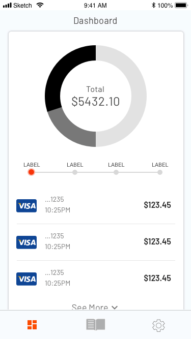
Merchants needed a way to see their day to day business clearly
The navigation in the current application was cumbersome
Clip has too many additional features being developed that needed a home inside the application
THE DESIGN
Let’s be honest, there are a ton of inventory systems on the market. A catalog is nothing new; an inventory system is nothing new.
The goal of the App revamp was to give merchants an intuitive system which shows their entire inventory and review their day to day business all in one application.
Goals:
Point of sale system
Inventory Management
Daily Transaction Reporting
Review and Edit orders
Clean design with access to all Clip features
Retain the easy checkout process of the original Clip app


BRAINSTORMING!
Before I begin each project I sit down with the UX team and do a short brainstorming session. This defines our goals for the project and exposes our initial ideas. The team will then produce a whiteboard version of the feature we are designing. From here we can better assess our project timelines and get a list of issues or questions we have for the developers.
USER-FLOWS AND WIRE-FRAMES
After the initial white-box session a series of user flows and wireframes are created to understand the users journey in its entirety. Each section of the app needed its own user flow created. After the user flows, a series of wire-frames were created to get an idea of all components (buttons, bottom sheets, etc) needed . This list of components became the initial building blocks of our design system manager.


DOCUMENTATION
Once a solid MVP is established from the user flows and wireframes I start documenting all screens required for the App revamp to be completed. This includes any components or moments of delight. All documentation is compiled in one location for the entire team to access. Documentation normally includes an user flows, wireframes, screen breaks-downs, Invision prototypes, and a few gifs for good measure.